In this contributor blog post, we are going to take a look at how we can create an MMM feed with Rockerbox data.
Note: This is an advanced use of Rockerbox data. Rockerbox does not currently support secondary data analysis via third party templates. For any questions or assistance with this template and feed, please reach out to the author Mike Taylor: @hammer_mt.
Since iOS14 gave users the right to turn off tracking, privacy-friendly techniques like Marketing Mix Modeling have become firmly established as a key part of the Attribution Stack. However these probabilistic techniques can take a lot of work to get right. Often the biggest hurdle is simply getting the data in the right format, so you can start building your model. CrowdFlower found cleaning and organizing the data takes up as much as 60% of a data scientist’s time!
Rockerbox is an ideal tool for managing data, and with the recent release of Rockerbox Data Sync and the Google Sheets Templates library, Rockerbox can also be used to make Marketing Mix Modeling more accessible. What’s more, if you pull all of your data together with Rockerbox, you don’t need to do it again next quarter when the boss wants a model update!
In this blog post, we’ll focus on a template we created with Rockerbox to enable Marketing Mix Modeling with Rockerbox data. You can even modify this template to create an ‘always on’ model if that’s what you need, automatically updating as more data arrives.

This template uses a simple Linear Regression algorithm (the LINEST function in GSheets), which should be fine for your first model. However it’s the MMM Feed – data formatted in the right way for modeling – that’s the important part. Once you’ve set up your data feed you could implement your own algorithm with Google Apps Scripts, supply the data to an MMM tool like Recast, or export the data to CSV for use with Meta’s Robyn, Google’s LightweightMMM, or Uber’s Orbit. You also might want to implement other common MMM features, such as Diminishing Returns (the saturation of channels at high spend levels), and Adstocks (the delayed impact of advertising over time).
> Rockerbox MMM Template
We’ll go into detail in this blog post about how to manipulate your Rockerbox data into this template, and how to read the template to make attribution decisions. However I also created a complementary course on Vexpower, “Compare our attribution to MMM”, which will walk you through how to do it and test your knowledge at the end.
Tabular data
To build a Marketing Mix Model, you need Tabular data. This means just one row per date period (day or week), and one column per variable you want to use in the model.

To do this usually takes some manipulation in your data warehouse, or in our case Google Sheets. The data from Rockerbox doesn’t come out this way – it’s much more granular – but we don’t need this level of detail for aggregated techniques like MMM. Rockerbox gives you a lot of attribution information by default, including last touch, first touch, and data-driven attribution. This should be seen as an alternative opinion to the result we get from our MMM, and we’ll compare the two to zero in on what the true incremental performance of our campaigns is.

Pivot Table
To aggregate this data for our MMM, we can use Google’s Pivot Table functionality. Select the whole example data sheet (81,572 rows and 12 columns), and in the Navigation menu select Insert > Pivot Table > New Sheet. The example data contains almost every channel you could imagine as an Ecommerce business, so it has more columns than you could reasonably include in a Marketing Mix Model (the rule of thumb is 10 observations i.e. rows per variable). So for our template we only included media channels, by filtering for if SPEND > 0. Most MMMs will include organic variables in the model to account for non-marketing spikes and dips, however you must be careful when controlling for seasonality.

Next up you want to do the same with your revenue or sales metric, whatever conversion event it is that you’re trying to predict. Again just Insert > Pivot Table in a separate sheet, and then you can bring everything together into the ABT (Analytical Base Table) tab, which is the clean data ready for modeling. To do this just reference the DATE in the first column, the REVENUE in the second column (from the new tab we just created) and then reference the media variables to make up the rest of the columns. Once you have that, you just need to reference the variables with a LINEST function to create the model.

Adjusting The Template
Ok ok, there are a few more steps than that. You can use our template for your own data, but when you do you’ll need to make a few adjustments to get it working for the number of variables you use and the date range you’ve pulled. The first thing to adjust is the LINEST function, which references the REVENUE column as the first parameter, and all the media variables as the second. Go to cell C3 and select all of your media data (ABT!C2:AQ613 in the example) for the second parameter, as well as selecting all your REVENUE data (ABT!B2:B613 in the example) for the first parameter.

Almost everything else in that sheet should now work, though you might need to delete a few columns if you’re using fewer variables, or drag the formulas across if you’re using more. Note that we use a crazy formula to TRANSPOSE the variable names, as the LINEST function spit these out backwards. There is one more thing you need to update, and that’s the Prediction column in the Pred tab. Make sure that’s adding up the contributions so that the error can be calculated.

The final thing you can do, completely optional, is to copy the Media tab and swap the SPEND variable for one of the attribution model columns. For example in the template we used LAST_TOUCH, so that we can compare the results of our Marketing Mix Model, with that of what our last touch attribution from Rockerbox is telling us. Neither is right or wrong, they’re two different opinions on what drives performance, with their own strengths and weaknesses. You can see the results of combining this data with the output of the model in the Multiplier tab, which compares the two.
Using the Template
Finally you’ve done the hard work, and have all the data in one place in the right format, in a basic model. Right, so what are you looking at? If you’ve never seen an MMM or haven’t used Linear Regression since high school, it can be hard to tell. Let’s run through the main areas of the model you’ll find useful.
Coefficients

The coefficients are what the model thinks the target metric goes up by with each incremental unit of that variable. So for example a coefficient of 10.71 for Tatari, means the model expects $10 of revenue for each $1 spent in this channel. This is not a guaranteed value, as its accuracy is only as good as the validity of the model.
One thing you’ll find is that it’s far easier to make a model that predicts well, but has implausible or even nonsensical results for some of the coefficients. For example the model thinks Spotify actually decreased revenue when it was running by -$4 for every $1 spent, which is unlikely. These sorts of values can be dealt with by using a more sophisticated algorithm, for example Bayesian Markov Chain Monte Carlo, which can set limits on what a “realistic” coefficient result would be (i.e. non negative).
P Values

The concept of a P value is something most people have heard of, but most everyone gets wrong. To be honest, it can be difficult to truly understand what’s going on with P values if you don’t have statistics experience. However for now you just need to know that anything above 0.05 is bad (statistically insignificant) and below 0.05 is good (probably correct). You should trust what the model tells you about a variable less if you have an insignificant P value.
Margin of Error
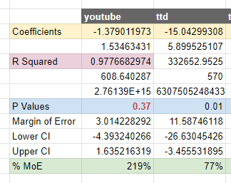
Similar to P Values, Margin of Error is a concept that a lot of people have heard of, but that make statisticians angry when they find out what people are using them for. You can intuit them similarly to P Values, and they are related, so for example a high margin of error signals that the model doesn’t know enough about that variable to make a good guess. That doesn’t mean a low confidence level always means the coefficient is correct: the recommendations of a model have to be taken together as a whole, as getting one variable wrong can cause biases in the others.
Accuracy Metrics

We highlight the R2 or R-squared metric here, because it comes for free from the LINEST function. However many have concluded that this is close to being useless as an accuracy metric, so you’re better off sticking to MAPE. This stands for Mean Absolute Percentage Error, which sounds complicated, but you can intuit it as the percentage chance of being wrong on the average time period in your model. Anything approaching 10% or below is great, though as we can see you can have an accurate model that still has implausible coefficients. The DECOMP variable is DECOMP RSSD, a metric the Meta Robyn team invented which tells you how much the model agrees with the spend allocation, a good check for plausibility.
Predicted vs Actual

This chart is the reward for all of your hard work! It shows what the model predicted versus the actual revenue for the time periods of your analysis. Our model is holding up pretty well here: the blue line and the gray line follow each other closely, even with lots of spikes. When building a model it’s useful to look at this visualization and then investigate any days they diverge: is there a variable biasing the data, some missing variable (like a holiday) or something else you should account for?
Waterfall Chart

If you need to visualize relative contributions of different variables, waterfall charts are great. They show positive and negative contributions, and give you a sense of the relative importance of each variable based on the size of the bar. Together they add up and cancel out to go from zero all the way up to the Subtotal, or the amount of Revenue you had for the time period (here shown in millions of dollars). For our model we can see that there are a handful of channels that contribute a lot, and then a string of long tail variables that contribute very little.
Multiplier

This is the really actionable part of the model. Of course this is only good for making real world decisions, if you have a valid model (and that’s a bigger topic). However, assuming that you’re happy with your model, and it’s both accurate and plausible, you can use the multiplier tab to make decisions about channel optimizations. For example if we look at Facebook/Instagram, modeled revenue is 3.19x higher than what was being reported on a Last Click. That might make sense given that Meta is no longer able to accurately track conversions since iOS14 (relying on Apple’s SKAN), and because last click tends to underweight upper funnel channels like Facebook and Instagram, where many sales may come from viewing an ad and then searching the brand term, instead of clicking. If the multiplier was negative, that would be the model telling us that the channel is claiming more credit than it deserves, and performance should be down weighted accordingly. These decisions make a big difference if you’re optimizing six or seven figure budgets across multiple channels: getting more accurate with your allocation can save you millions of dollars!
Continue the conversation with us on Twitter: @rockerbox and @hammer_mt.
About the Author
Mike Taylor was a co-founder at Ladder, a 50-person growth marketing agency with $50m spent and 8,000 experiments run, for clients like Booking.com, Monzo Bank, and Facebook Workplace. He is currently building simulator-based courses for data-driven marketers at Vexpower.
 Google
 Facebook
 Instagram
 TikTok
 Snapchat
 Reddit
 Pinterest

.png?width=50&height=56&name=medal%20(1).png)


-May-15-2023-04-57-59-5122-PM.png?width=435&height=200&name=Blog%20Headers%20-%20New%20(1)-May-15-2023-04-57-59-5122-PM.png)
%20(13)-1.png?width=435&height=200&name=Blog%20Headers%20-%20New%20(1200%20%C3%97%20800%20px)%20(13)-1.png)
