Note: This is an advanced use of Rockerbox data. Rockerbox does not currently support secondary data analysis via third party templates. For any questions or assistance with this template and feed, please reach out to the author Mike Taylor: @hammer_mt.
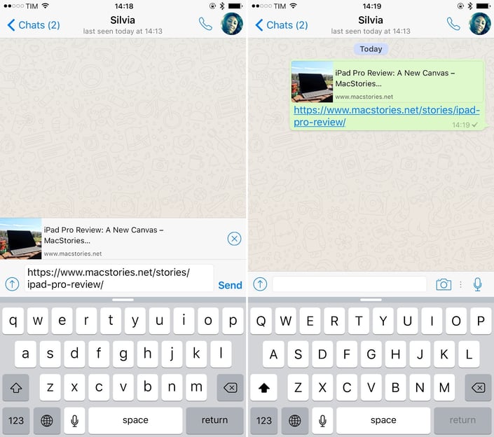
Dark social describes the sharing of content through private channels not easily traceable through standard analytics tools, such as messaging apps, email, and closed social media groups. One of the most common examples is Whatsapp, which doesn’t share referrer information with the websites their users share links to. There’s no easy way of knowing whether those visitors came from Whatsapp, or somewhere else.
 https://stackoverflow.com/questions/19778620/provide-an-image-for-whatsapp-link-sharing
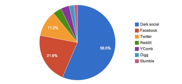
The term “Dark Social” was coined by Alexis Madrigal, a senior editor at The Atlantic, in a 2012 article titled “Dark Social: We Have the Whole History of the Web Wrong”. He noticed at the time that more than 56% of The Atlantic’s traffic was already coming from dark social channels. The implications were that if you were religiously tracking engagement on social media like Facebook, you were only seeing the tip of the iceberg: dark social was already significantly more important to optimize for.
https://www.theatlantic.com/technology/archive/2012/10/dark-social-we-have-the-whole-history-of-the-web-wrong/263523/
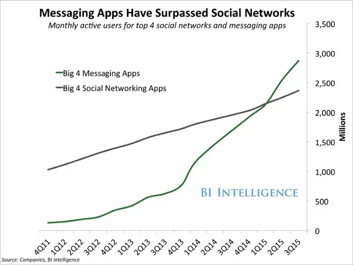
This phenomenon has only grown since the term originated, with the big 4 messaging apps surpassing the big 4 social networks in terms of active users in 2015. There is no standardized methodology for measuring the virality of these channels, and what isn’t measured doesn't get managed. Of course you should do all you can to add UTM tracking parameters to your marketing campaigns, but that still leaves a significant portion of your traffic unassigned. If you can’t tell the marketing source for this traffic, it can be difficult to measure what’s driving the virality of your product or blog content, which makes it harder to make effective decisions.
When you click a link, by convention a `document.referrer` property is passed along with the request. For example if you click a link on a public social network like Twitter, the `document.referrer` will contain “twitter.com”. This is what every website analytics tool relies on to know where visitors are coming from. Any traffic without a referrer is unassigned, labeled in Google Analytics as “(direct) / (none)”, or in Rockerbox as TIER_1 = “Direct”.
In this blog post, we will help you estimate, using Rockerbox data, how much of your traffic comes from dark social, and explore its potential impact on your business. We will also discuss one way that you can shine a light on dark social traffic, through modeling your Word of Mouth Coefficient, complete with a template for you to use (originally published in Reforge by Yousuf Bhaijee and myself). By the end of this post, you will have a better understanding of this important topic and how it can affect your business, as well as how to start solving it.
Word of Mouth Coefficient
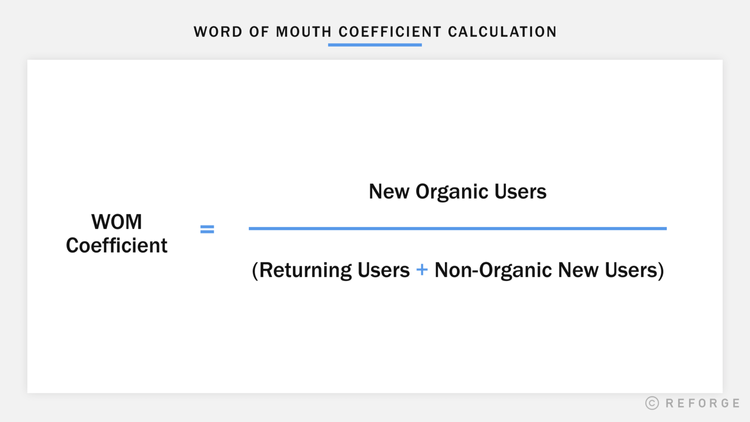
This term was coined by Yousuf Bhaijee formerly at Zynga, where he first used this technique to determine which games had more or less inherent virality. The insight is that for the majority of businesses, virality is not a function only of new users, as much of the literature assumes, but of how many people are actively using your product in a given time period. Word of Mouth Coefficient is a metric which measures the relationship between new organic users (direct traffic) and returning users, so you can estimate the impact of dark social on your business.
 https://www.reforge.com/blog/how-to-calculate-your-word-of-mouth-coefficient
You can look at every time someone uses your product as a chance for them to share it with a friend. The more important a product is in someone’s life, the more likely you are to be top of mind when an opportunity to share arises. Someone who uses their Apple AirPods every single day is far more likely to recommend them to a friend, than someone who bought them once and left them in the drawer. This sharing behavior can also occur passively: the trademark white color of Apple’s headphones reminds people who see them on the street, and reinforces the idea that they must be high quality if plenty of cool, trendy people are using them. In our research we found the relationship between active users and new direct users was extremely stable, and predictive: making it a useful metric to compare across companies and sectors.
 https://www.reforge.com/blog/how-to-calculate-your-word-of-mouth-coefficient
This means that virality is fundamentally linked to retention: the more repeat usage you get, the more sharing will occur. If you look at product categories that get the most virality, such as social networks, productivity apps, or video games, they tend to be products people use every day. Products that are used infrequently like life insurance, legal assistance, or airline flights, still get referred based on their merits, but they rarely grow exponentially – i.e. where each user brings in more than one additional user – where the viral coefficient is greater than 1.
 https://app.vexpower.com/sim/we-need-to-go-viral/
It has to be noted there are some product categories that don’t fit this pattern, where sharing is either sensitive, or a general lack of interest means sharing activity is limited. However based on our research, the majority of Direct-to-Consumer (DTC) products are likely to find this pattern holds. In using this template, if you observe this pattern in your business too, you can use it to identify anomalies in sharing activity, as well as forecast forward to see how virality will contribute to future sales.
 https://www.reforge.com/blog/how-to-calculate-your-word-of-mouth-coefficient
I worked with Yousuf to further develop the technique, test it out on a number of different companies in various verticals, and produce a template which originally appeared in our Reforge post “How To Calculate Your Word of Mouth Coefficient”. I also followed up with a word of mouth coefficient tutorial on Vexpower called “How do I measure virality?”, which walks you through how to use the template. For this blog post I have adapted the template to work from Rockerbox data, so you can seamlessly export from your account and use the template. Make a copy of the below spreadsheet so you can follow along and apply the method to your own data.
> Rockerbox WoMCo Template
How to use the template with your own data
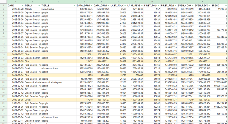
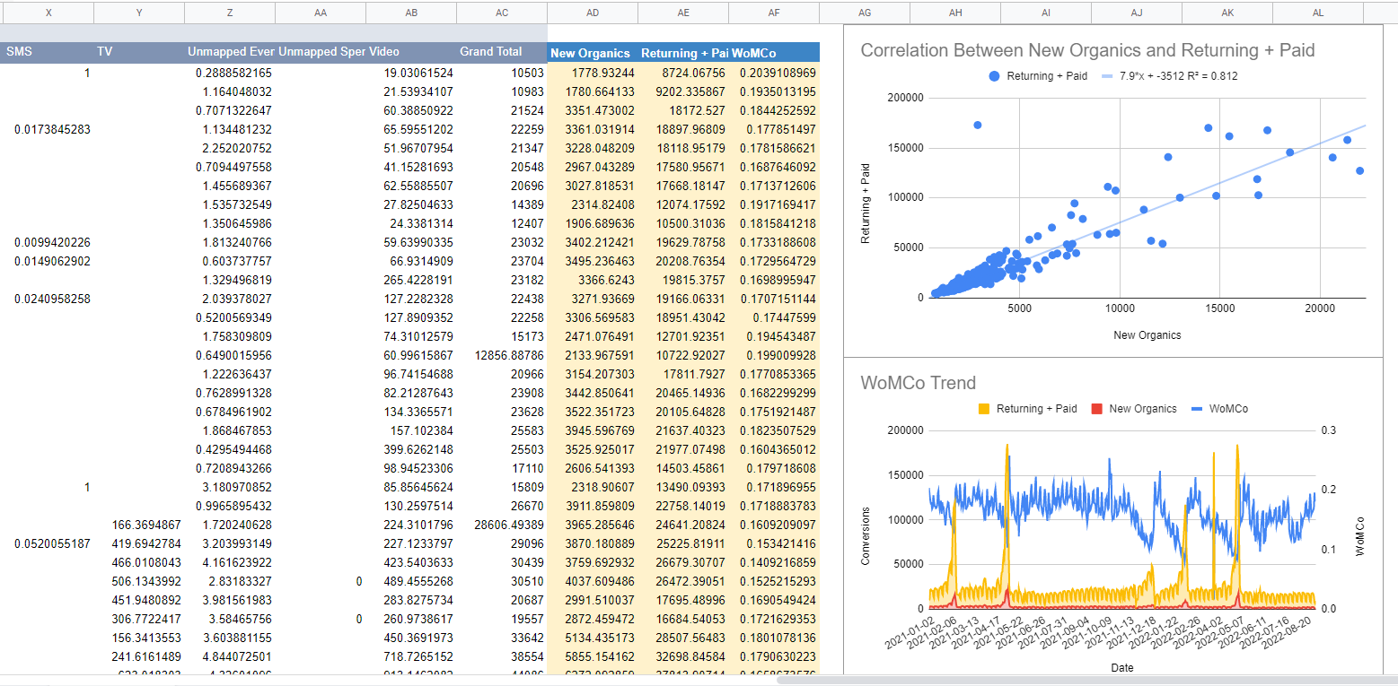
The template takes in data exported from Rockerbox, and puts it into a pivot table in order to create two charts. If you take a look at the Data tab, it shows conversions by date, split by tier, and that’s what you need to replace with your data.
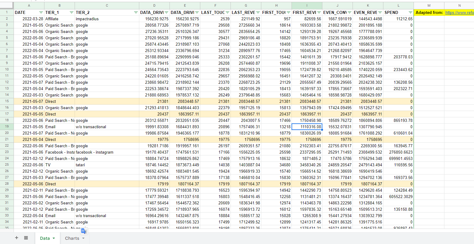
Step 1
Delete this data and paste in your own data in this sheet, in order to start using the template. Note: once you paste in your data, the charts and pivot table will likely break, so you’ll need to do some adjustments, which we’ll cover next.
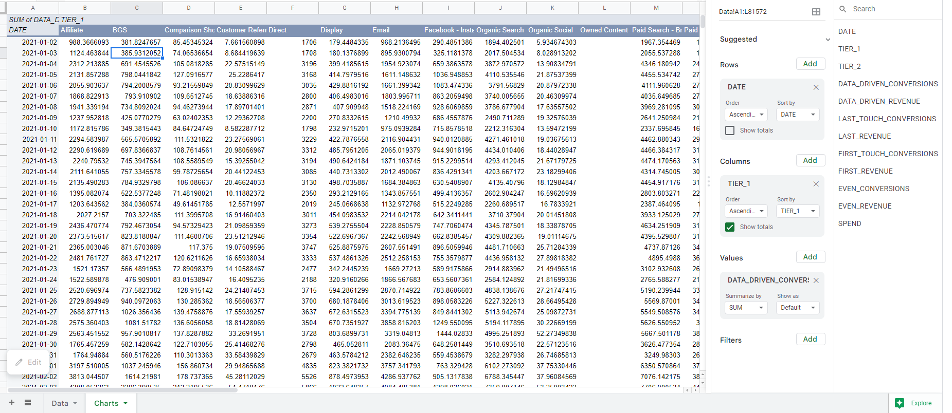
Step 2
Over in the Charts tab you’ll see the pivot table that shows data-driven conversions by date. In the top right corner when you edit the pivot table you can see the cell reference “Data!A1:L81572”: you need to change this to whatever cells your data is contained in. You might have more or fewer rows and columns, so just make sure you’ve selected your full data range.
Step 3
Next up you need to define the New Organics metric, which represents anything in Tier 1 that could be considered ‘Word of Mouth’. For this exercise we chose Direct, Customer Referral, Organic Social, Referrer, and SEO (for this client SEO was mostly brand searches).

Once you have this metric defined, simply subtract it from the Grand Total column to get what’s left, which we have labeled as Returning + Paid, in reference to the original WoMCo template.
Note these definitions don’t line up exactly to the original template, because in this data we’re not splitting out returning customers, and we’re using conversions not traffic. However you’ll see in the next section it works good enough for demonstrative purposes. Most of the work here will be adjusting the definitions for your data until you find a correlation between word of mouth and the rest of your customers.
Step 4
Finally it’s time to adjust the charts. As your data likely has more or fewer columns or rows, your pivot table will cover a different data range than ours. You can adjust that by editing the charts in the pane on the right side, in the field labeled “Data Range”, with a value of “AD2:AF614,A2:A614”. In our example the range A2:A614 is the dates for the X Axis, and the other range AD2:AF614 is the actual data we’re plotting.

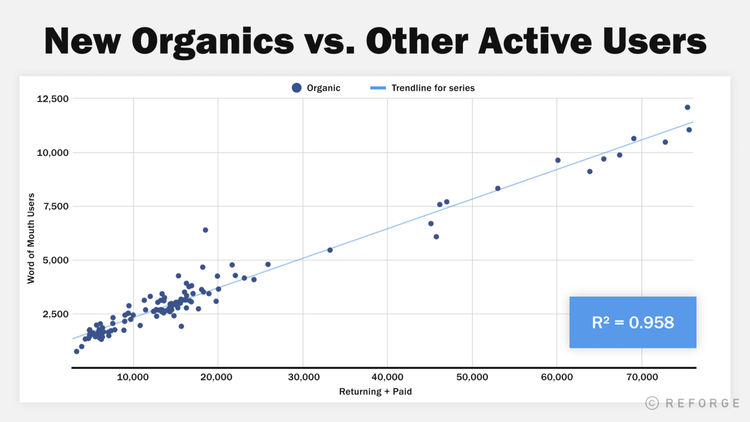
Chart 1 only needs the second range, as it is making a scatter plot showing the correlation between New Organics and Returning + Paid, so you can tell how robust the relationship is. The second chart needs those two columns plus the WoMCo metric, and the Date range. If your WoMCo calculation got messed up in the import, you can recalculate it as New Organics / Returning + Paid.
How to interpret the Word of Mouth Coefficient analysis
Word of Mouth Coefficient is really just a way for us to identify and quantify the relationship between new word of mouth and existing users. Everything is open to interpretation, but it allows you to identify interesting areas for further investigation. It’s in digging deeper into these areas that you’re likely to learn the most about your business, and what drives Word of Mouth.
Correlation Chart
The first of the two charts is to check you’ve found a stable correlation between New Organics and Returning + Paid. This can vary significantly between businesses, and in many cases we found we had to dig a little deeper to find the right combination of traffic sources to include or exclude to establish a high correlation. Ideally you’ll try a few different definitions until you get at least an R2 of 0.7 or above. One thing that worked for us in our research was to filter SEO just for visitors to the homepage (the assumption being that it is most likely to be brand search), so try that if you’re stuck, as well as checking your campaign UTM parameters are consistent. You can also try changing the values from data driven conversions to last click, or even to traffic, to see if that helps identify a pattern.

In the chart above you can see our R2 is 0.812, though at higher conversion levels it has a fanning out pattern, indicating that we could do better by explaining why behavior changes during periods of high demand. We can also see an extreme outlier in the dot in the top left, a day where Returning + Paid was way higher than expected for the number of New Organics. Talking to others on the marketing team to understand these spikes and anomalies can go a long way to identifying new ways to change your metric definitions for this analysis.
Trend Chart
The second chart will only really be useful once you’ve established a robust correlation. It shows the trendline over time for both New Organics and Returning + Paid. Now that you have a relatively stable Word of Mouth Coefficient metric, you can see where it varies, as that tells you something about user behavior. Look for spikes and dips in the metric, and how that correlates to absolute levels of paid or organic conversions. Identify what was special about those periods, and it can tell you a lot about what drives sharing behavior.

For example in the case of this client, you can see clear periods of increased investment in paid significantly harmed the average rate of sharing via word of mouth. This tells me both that we could potentially exclude paid from our metric in order to get a stronger correlation, and that our paid users are likely less valuable than our organic ones in terms of increasing the virality of our product. These spikes in users (and declines in sharing activity) lined up around important holiday periods, though the dropoff in sharing seems to start some weeks before the peak holiday time. We decided this may be caused by less engaged customers entering the category who just want to get in, get out, and don’t care enough to share the product with friends.
Any findings are purely correlative: they should be investigated and tested. This type of analysis is best for forming hypotheses, but can’t really be used to prove them. If you found something similar to what we did in this analysis, my next move would be to survey users and ask them about their sharing behavior. See how this changes around holiday periods, and identify potential ways to reverse this drop in sharing activity.
I’d also investigate the difference between paid and returning users, and see why their sharing activity is so much lower: do we have a channel quality issue? You can continue to monitor WoMCo over time and see what moves the needle, as well as more actively run experiments where you make a change in one geographic region, and see if it increases or decreases sharing relative to other regions.
Finally when you find a metric like this that’s relatively stable over time, it can be used for prediction: if you want to know what contribution word of mouth is going to make to your topline sales in the next few weeks or months, you can figure that out by taking the trend and extrapolating. This really helps in building more accurate forecasts for setting objectives and justifying budgets.
Conclusion
In conclusion, dark social refers to the sharing of content on private channels that cannot be easily tracked through standard analytics tools. This phenomenon has grown in recent years, with the big 4 messaging apps surpassing the big 4 social networks in terms of active users in 2015. There is currently no standardized methodology for measuring the virality of dark social channels.
The Word of Mouth Coefficient is a metric that can be used to measure the relationship between new and returning users in order to estimate the impact of dark social on a business. This metric is based on the idea that the more frequently a product is used, the more likely it is to be shared with others. It has been found to be predictive and stable over time for a number of businesses.
We provided a template for calculating the Word of Mouth Coefficient using Rockerbox data, but these principles are more widely applicable. Overall, the Word of Mouth Coefficient can be a useful tool for businesses looking to measure the impact of dark social on their products and content. If you know what drives sharing behavior, you can better understand the contribution of word of mouth to your business, and optimize it to drive more sales.
 Google
 Facebook
 Instagram
 TikTok
 Snapchat
 Reddit
 Pinterest

.png?width=50&height=56&name=medal%20(1).png)


.png?width=435&height=200&name=New%20Website%20Blog%20Headers%20(9).png)

